EasyFits website redesign
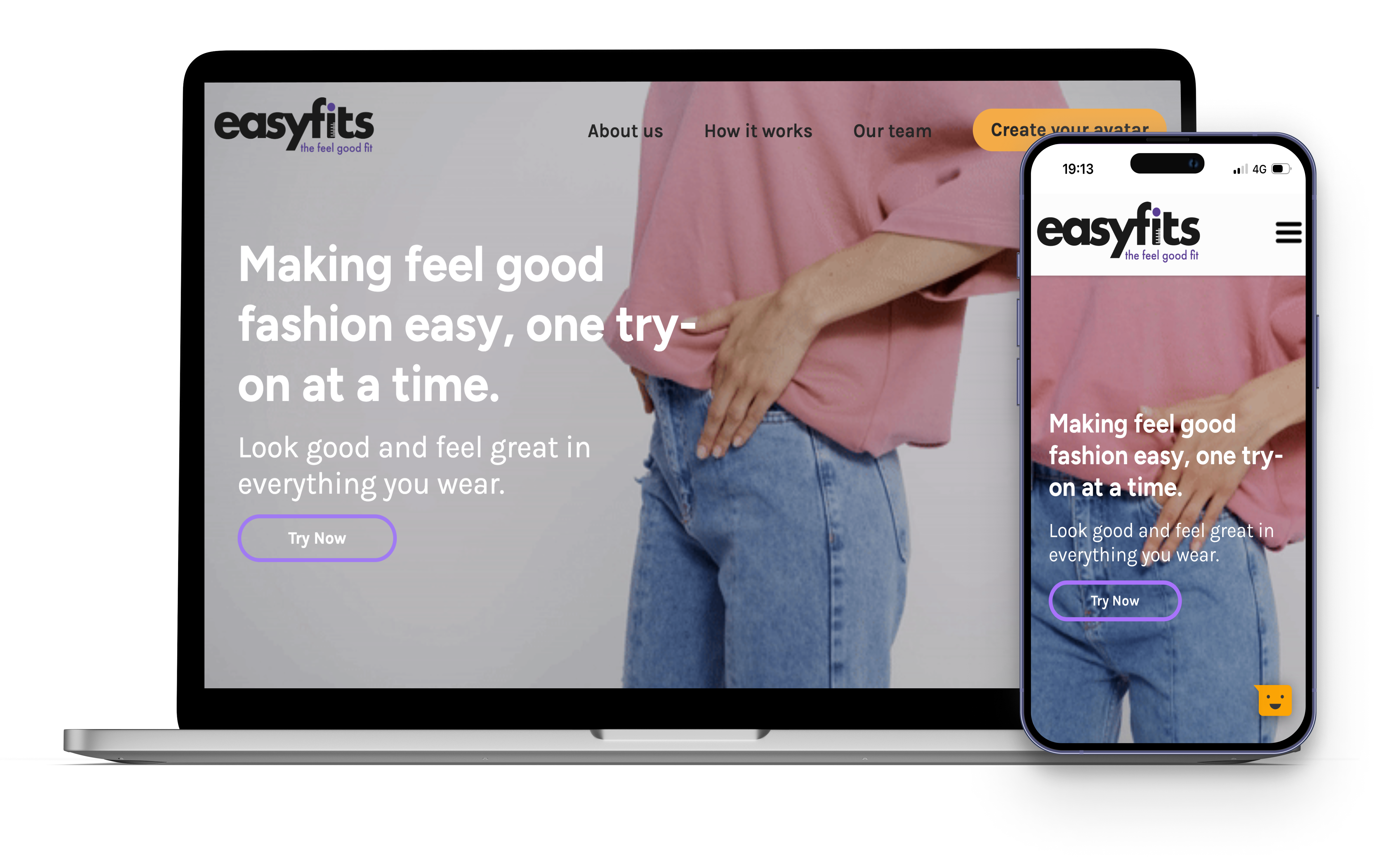
PROJECT OVERVIEW
EasyFits, a newly found start-up set out to create revolutionary solutions to virtually trying-on clothes. By helping you create your very own virtual fitting room with your personalised avatar, EasyFits aims to ebsure helping you find your fell good fit, simutaneously reducing your carbon footprint and saving your time by decreasing the number of returns.
So, in order to create a website which clearly defined what the goal is and initiated action, the website required a complete redesign. The previous website, which was built using WordPress began to create multiple interaction issues and frustrations, and failed to display their purpose as a start-up. Therefore, for this project, the goal was to design and test the new website, which invited users towards completing the required action and gave users a smooth and easy layout and navigation to follow.
My responsibilities:
Time: 5 months and continued
User Research and Testing
WHAT IS THE PROJECT ABOUT?
The problem:
The previous website has multiple issues with navigation, loading pages, and an unclear action for users to complete. There were elements on various pages, that even though may have seemed visually attractive, however were irrelevant to the message displayed, instead only woud cause some confusion on what to interactive with. Additionaly, information would not be displayed correctly, such as improper positioning and lacking a conherent information architecture. Therefore, Easyfit steered towards a revamp to not only improve functionality but to also include their revitalised brand guidelines.
The attitude going into this:
It was important to work within a multidiciplinary team to design and implement effectively with the goal of getting more users to sign-up and be the first ones to get a chance to experience EasyFits, as well as invite clients to invest into EasyFits.
Therefore, our design thinking was...
Effective user pathways to get more sign-ups
Improve navigation; make it simple and clear
Use any and all illustrations appropriately
Organise the information architecture
HOW WAS THE RESEARCH DONE?
Methodology:
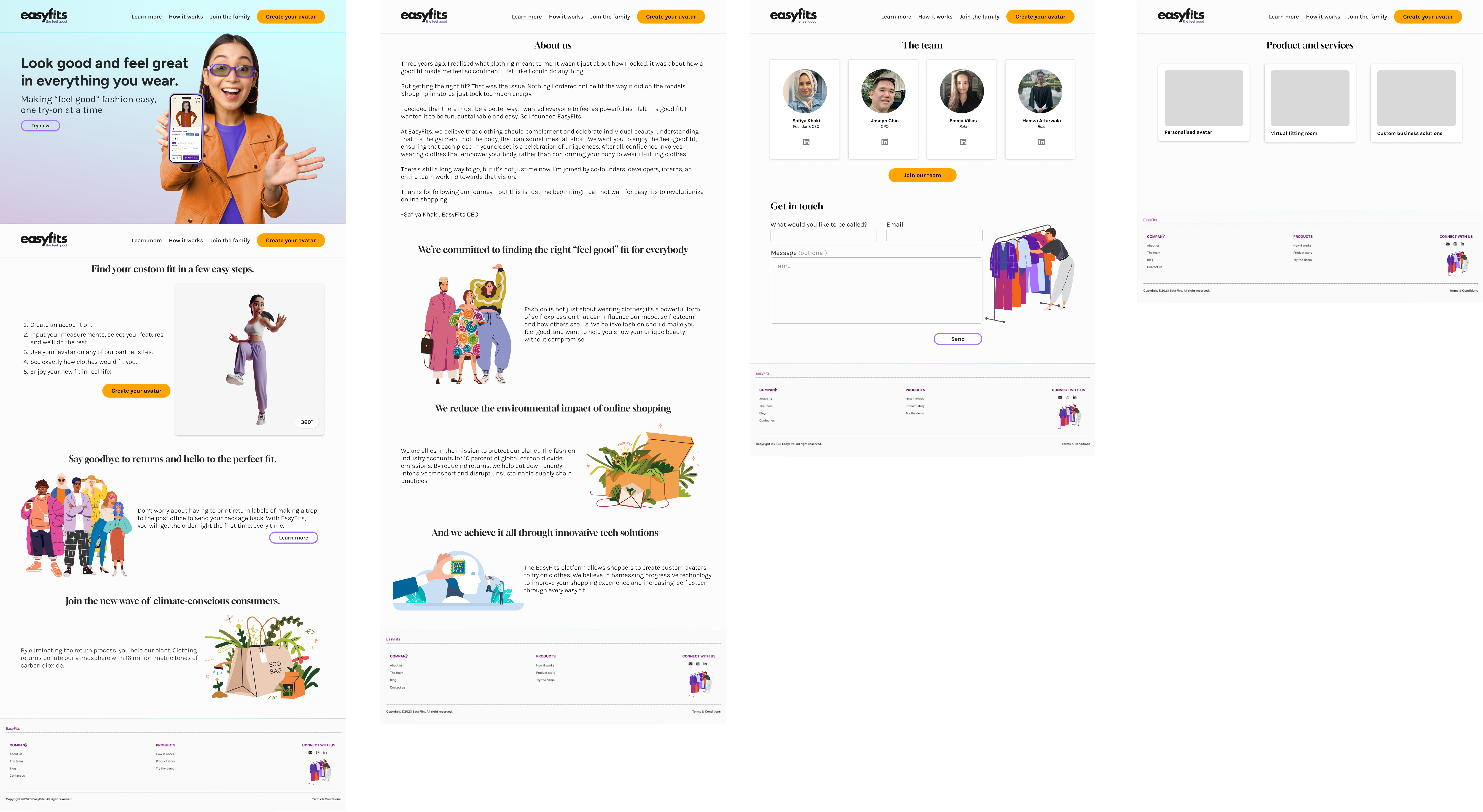
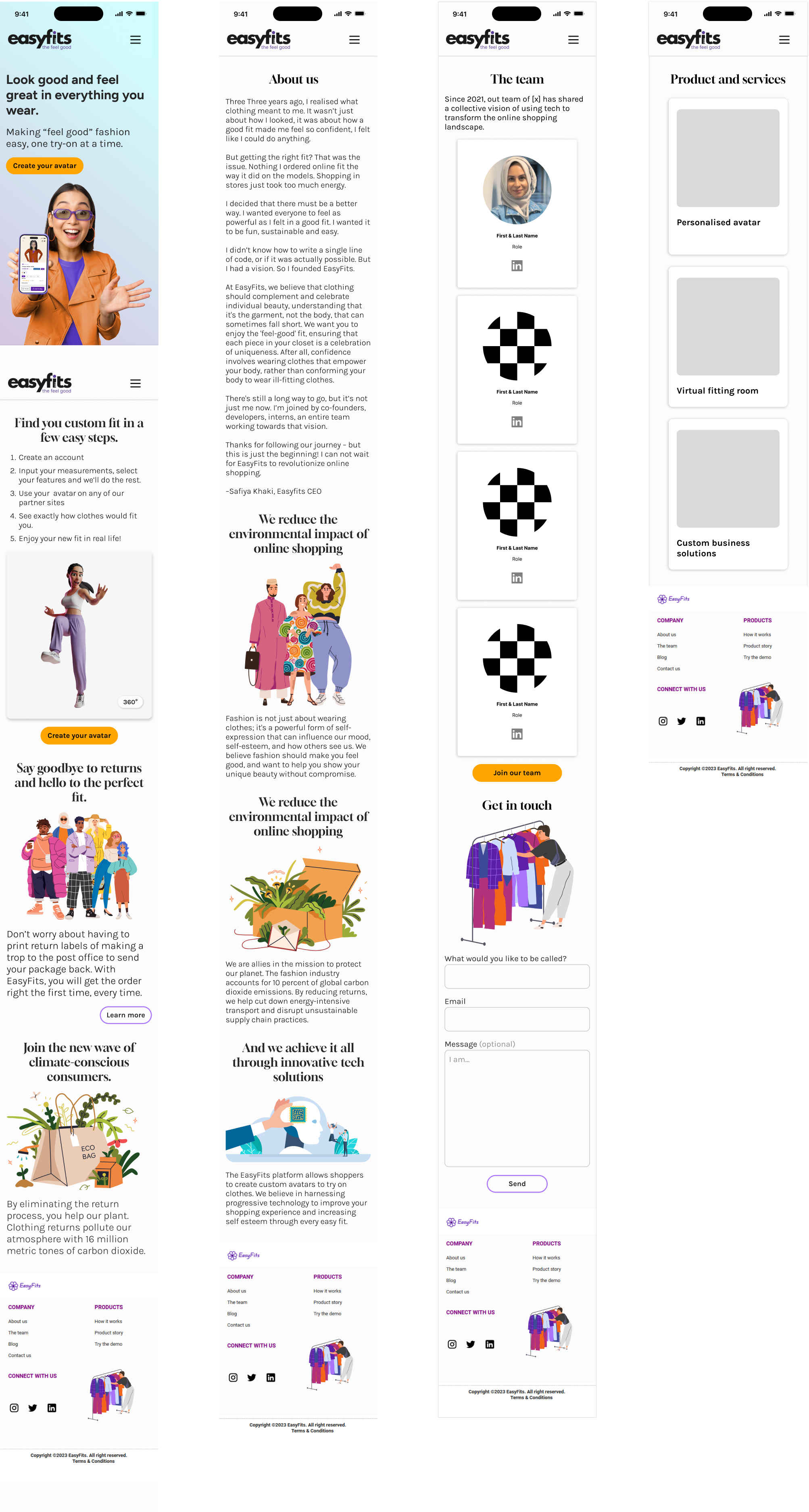
After digitising and prototyping the wireframes, we began our usability research. This included recruiting participants who met the target audience to understand they experience. Therefore, the target audience for this test was zillennials, those in both millenial and gen z cohorts, largely due to them being the cohort that have grown up with the emerging technology and will be the ones promoting the use of new technology in the future.
And thus, we decided to examine the following factors during the usability tests...
Are the CTAs clear and function as intended?
Did the user effectively gather information about EasyFits?
Did certain functionalities impede the user's journey?
How clear was the navigation?
Was the footer helpful?
INITIAL WIREFRAMES
Desktop
Mobile
Analysing the data:
Consequently, after testing, as well as team discussion, we found several improvements and iterations that could be made to enhance the user experience, and to save time, we decided to make these changes directly in the code as dev team had already began building the website.
And so, these changes included...
'How it works' page - get rid of hover effect on cards, makes skimming tedious
Change 'Join the team' -> 'Our team'- the later sounded like too corporate
Make button interaction clearer - addition of prominent hover states
Information architecture was not clear for new users
Mobile: begin with white header at the top - makes it easier to spot the menu
Re-organise information layout on 'About us' page - long paragraphs at the bottom
Show clear distinctions between different text/sections on the page with a background
Temporarily change hero while team is working on the image
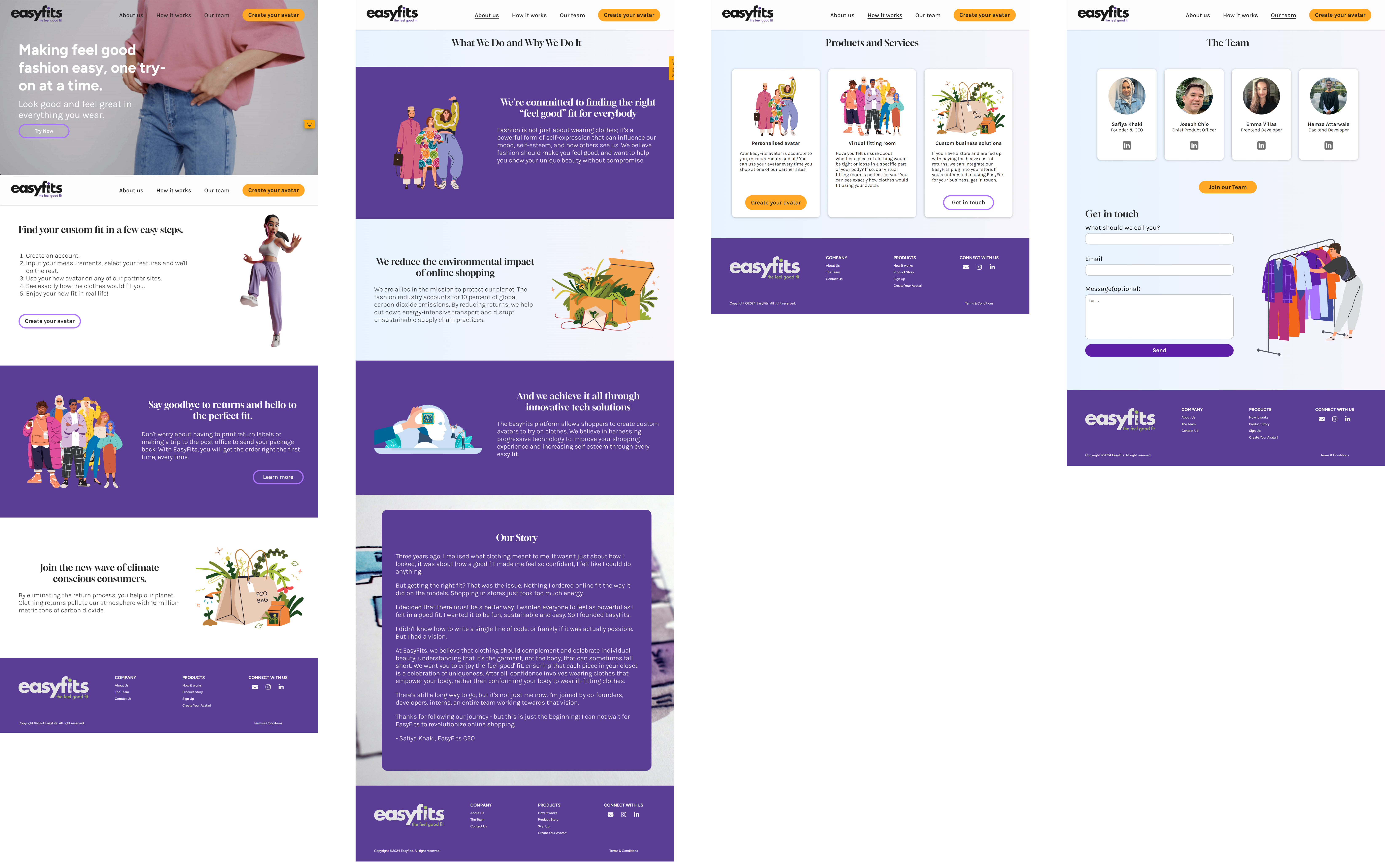
Final results
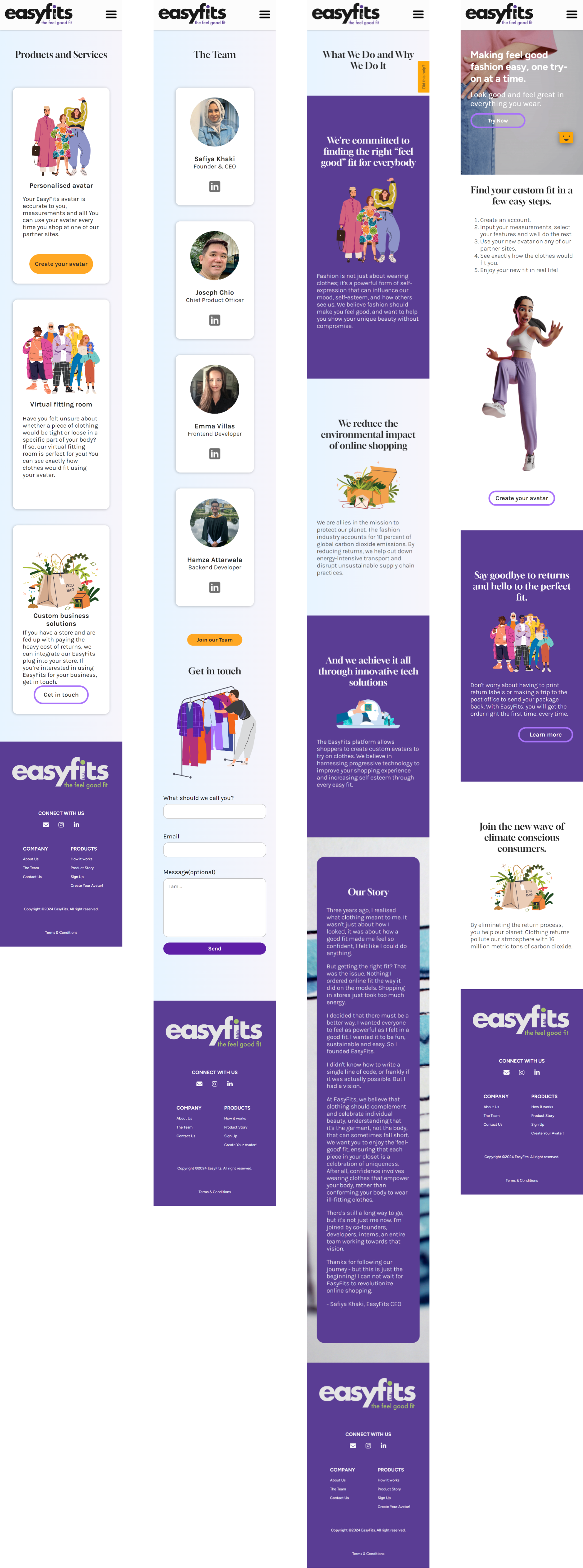
Having finished the UX/UI of the website, it was time to cross the finish line, and with the help of the amazing dev team and their talents, and the website was finally up and running.
Desktop
Mobile
Updates
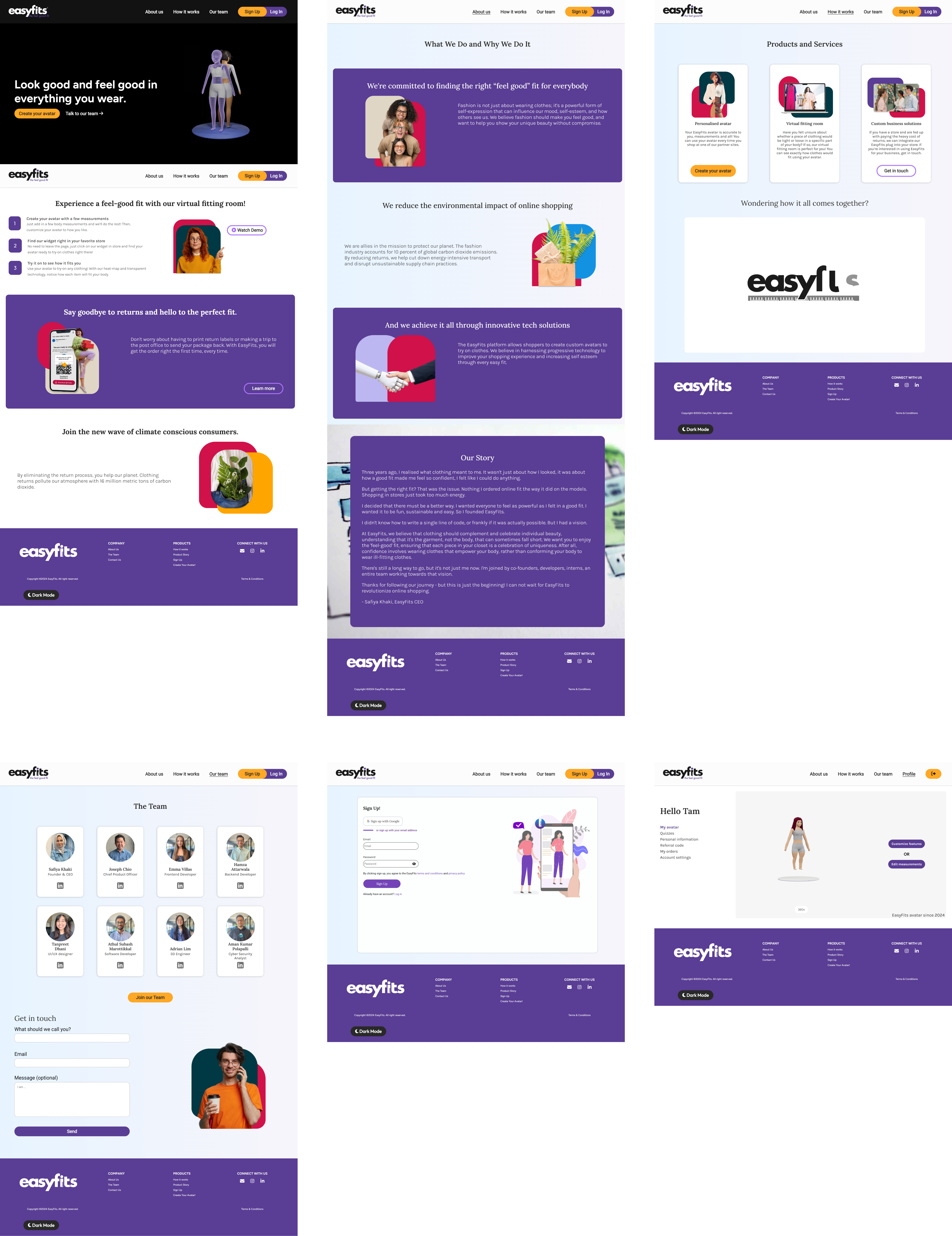
Updated landing page, images and dark mode
As EasyFits continues to grow, more content and information becomes available to users. With the aim of giving people a virtual fitting room, EasyFits' avatar creation is live for everyone, allowing users to create their avatars now, ready for try-ons in the near-furture. Therefore, with this now accessible to users and the website gaining more attention, we needed to ensure that new users fully grasp a good understanding of the product EasyFits has to offer.
Additionaly, having continued to gain more attention, one piece of collective feedback we received was that whilst the images on our website added a creative look, it didn't accurately display the product. Although we are selling a virtual fitting room, the clothing is tangible. Therefore, adding an element of realism with real-life images to emphasise the end goal of our product: the clothing.
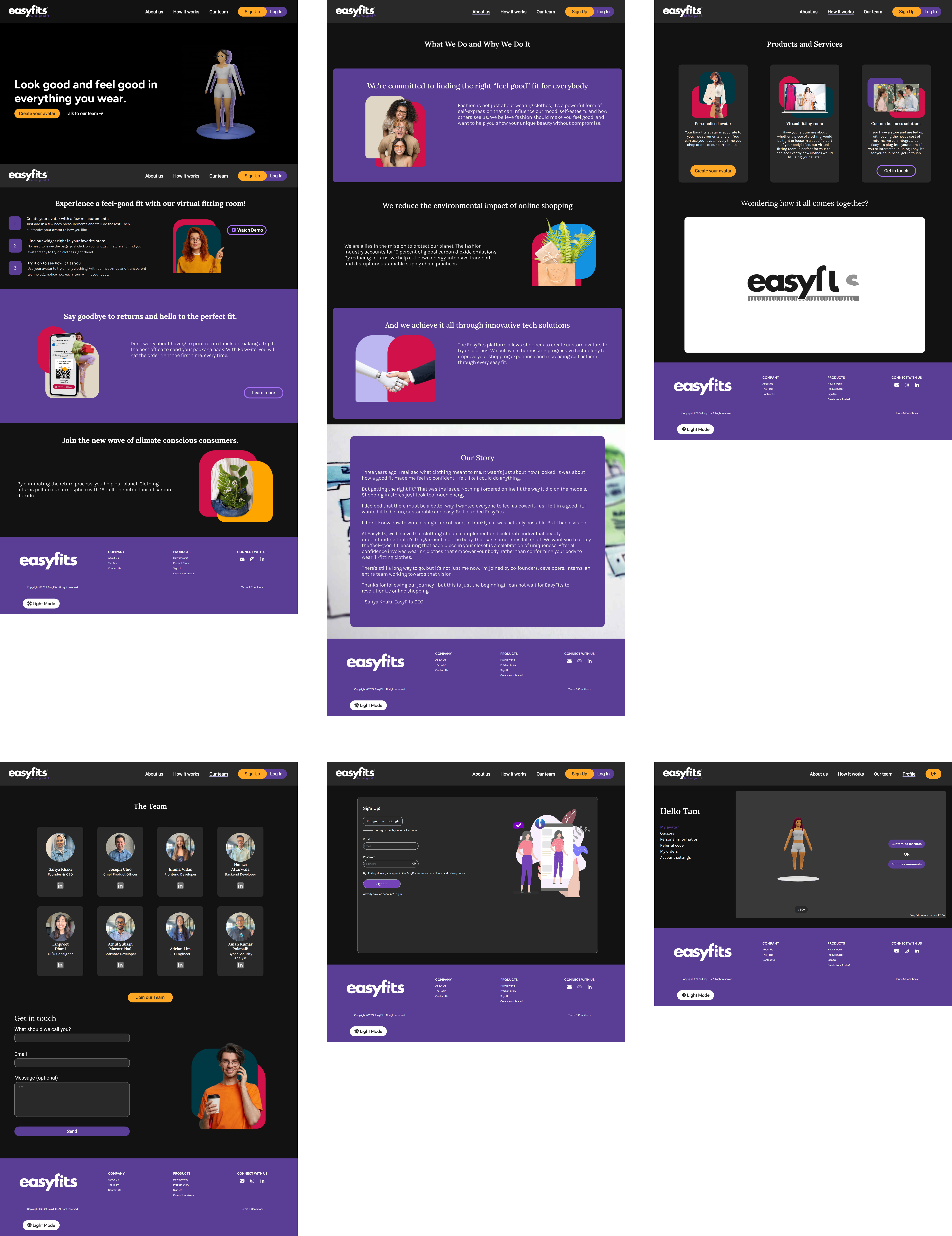
Lastly, Hotjar recordings and usability testing also revealed that some users tend to predominantly use dark mode when browsering. Whilst we can't fully control thrid-party dark mode apps/extensions, we can provide our own option for dark mode on the website. In order to deduce which content would need more focus, I investigated what the website already looked like with various thrid-party dark mode apps. From this, I was able to effectively implement a coherent colour-scheme for dark mode without affecting the original colour-scheme.
New landing page and images
Dark mode
Vsit EasyFits and sign-up to find your feel good fit.