BorrowBro

PROJECT OVERVIEW
Our project was focused on the concept of developing a platform (website) where users are able to borrow and lend their items for various purposes. For such reasons, our target demographic are people who are environmentally conscious, on a budget and have hobbies with items they might only need once or twice.
We set out to create a friendly and fun outlook to the website, whilst still maintaining a tone of seriousness when it comes to borrowing and lending your personal items.
My responsibilities:
Time: 4 weeks
User Research
WHAT IS THE PROJECT ABOUT?
The problem:
We went into this project with the idea and knowledge that current borrowing and lending platforms, when examined, are not entirely user friendly and neither do they have a purpose as to why they've created this platform.
We also noticed several accessibility and communition issues with these existing platforms, which to us, would create a trust problem between the lending and the borrower. How were the people protected? How were their items protected and what were the consequences of damnage or loss of an item?
Therefore, we aimed to create the BorrowBro website which makes communicating with one another much easier, creating that environment of trust, and making borrowing and lending a safer and the first option, and thus, creating a more sustainable pathway.
HOW WAS THE RESEARCH DONE?
Methodology:
We conducted six 1v1 interviews with individuals who had or didn't have experience in borrowing and/or lending items on a similar type of platform. This was so we could understand what type of interface we needed to create in order to encourage people to borrow instead of buy, simultaneously targeting waste reduction and promoting sustainability.
Hence, we focused on understanding...
Type of items typically borrowed or lent
Situations and occasions items would be borrowed/lent
Challenges people felt during this process
Possible features user would like to see
Analysing the data:
Several themes emerged from analysing the interview data uisng an affinity diagram. This included...
People borrow/lend to reduce waste and save money and space
Tend to borrow items that are infrequently used
People borrow items for DIY and home improvment projects
Build relationships with people with similar interests
Find it challenging to ensure items are in good condition
Find it difficult to coordinate pick-up times
Need the platform to ensure data security and item insurance
Need effective methods of clear communication
Would like to have a way to build trusted groups
Definition and Ideation
READING THE USER'S MIND...
From the interviews, we gathered that users were looking for a website, which does not only allow them to safely borrow and lend items, but also be able to build a community with trusted individuals. This would not only ensure safety, but many mentioned the convinience and sharing interests with others behind it.
SO, WHAT FEATURES TO INCLUDE?
Using the I Like, I Wish, What If methodology, we collectively outlined the pain-points and needs discovered from the research and each voted on the most promising features and tried to implement as many as possible without making the interface too complicated. These included…
Ability to negotiate a price
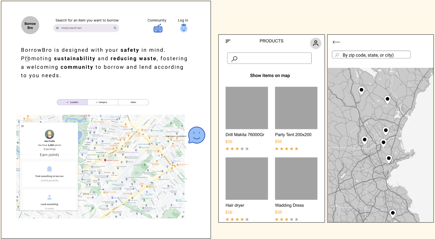
Availability of items nearby show on a map
Delivery option, with or without charge
Direct messaging feature
Sustainability badges to reward users
AI-powered recommendations
Therefore, from this we introduced our brand's value proposition that we aspired to follow when designing the website:
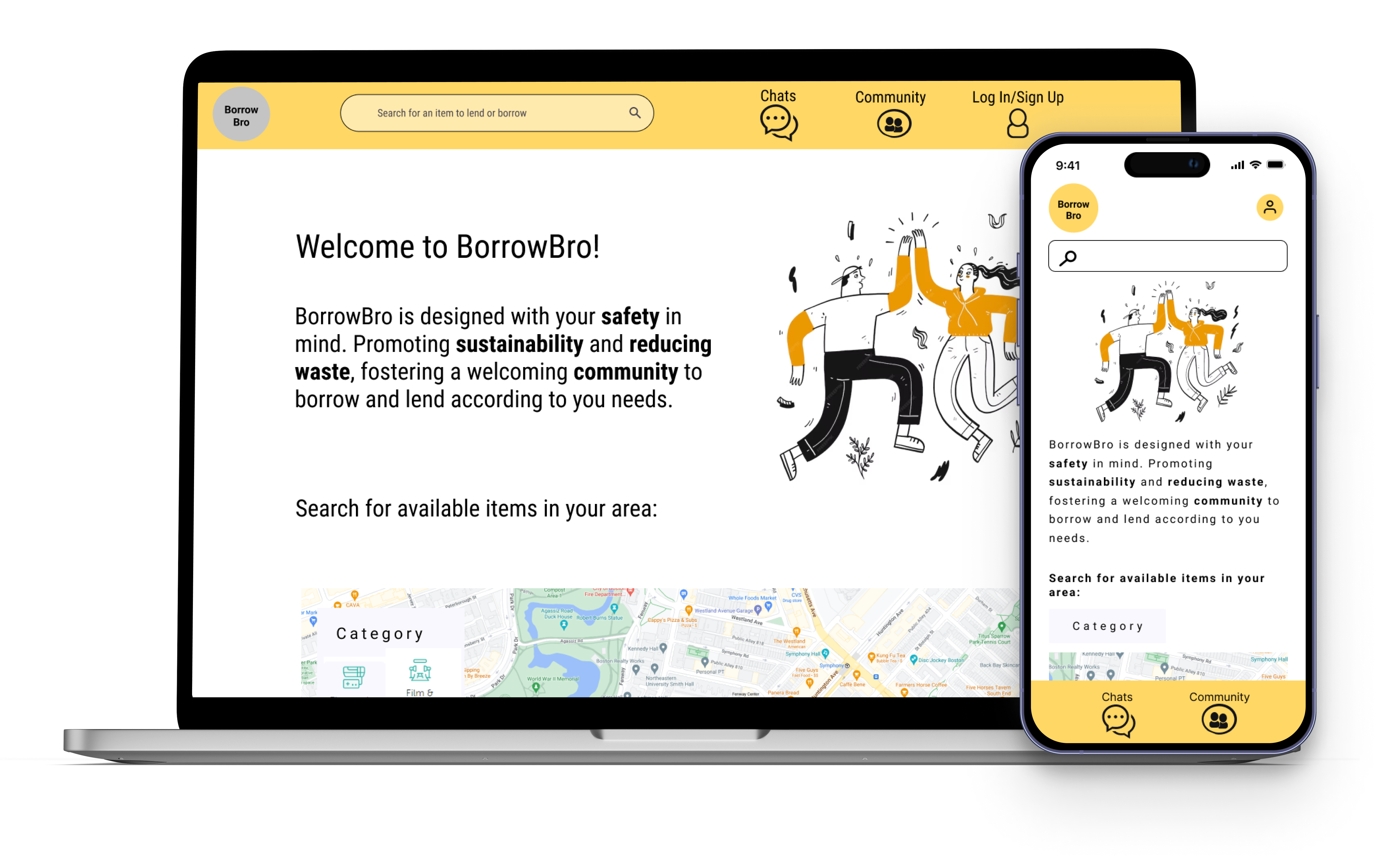
"BorrowBro is designed with you safety in mind. Promoting sustainability and reducing waste, fostering a welcoming community to borrow and lend according to your needs
Prototyping
COLLECTIVE BRAINSTORMING
When is came to designing the desktop and moboile, I was responsible for creating the designs for the mobile layout of the website. So, I worked alongside my partner who was designing the desktop layout, and we worked together to make sure there was correct and smooth RWD.
Mobile and Desktop pages (different screens)

THE FINAL DESIGNS?
Desktop

Mobile
